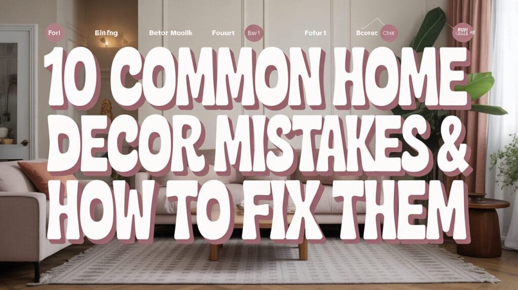
You know that feeling when you walk into someone’s home and something just feels… off? Maybe you can’t put your finger on it, but the space doesn’t quite work. Well, I’ve been there too – both as the confused homeowner and the slightly judgmental guest (hey, we’re all human!). After years of making my own decorating blunders and helping friends fix theirs, I’ve noticed the same mistakes popping up again and again.
Here’s the thing: great home decor isn’t about having the biggest budget or the fanciest furniture. It’s about avoiding those sneaky little mistakes that can make even the most expensive room feel awkward. So grab your coffee, and let’s chat about the 10 most common home decor mistakes I see everywhere – and more importantly, how to fix them without breaking the bank.
Mistake #1: Pushing All Furniture Against the Walls
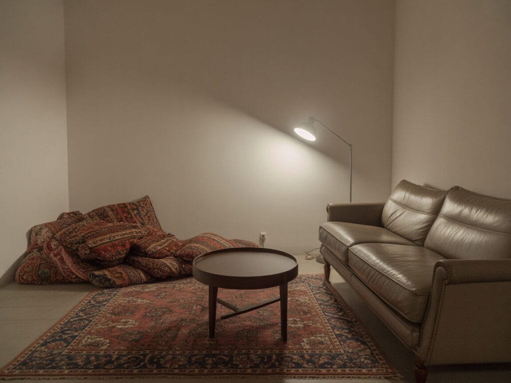
This one drives me absolutely crazy, and I see it everywhere. People think they’re maximizing space by shoving every piece of furniture against the walls, but they’re actually making their room feel like a waiting room at the dentist’s office.
I learned this lesson the hard way in my first apartment. I pushed my couch against the wall, thinking I was being so smart about space. The result? A room that felt cold and uninviting, with this weird dead zone in the middle where nobody wanted to hang out.
The Fix:
- Pull furniture away from walls by at least 12-18 inches when possible
- Create conversation areas by angling chairs toward each other
- Use area rugs to define seating groups and make the space feel more intimate
- In smaller rooms, try floating just one piece (like a sofa) to create better flow
Trust me, your room will instantly feel more sophisticated and welcoming. It’s like magic, but better because it actually works 🙂
Mistake #2: Choosing the Wrong Size Area Rug
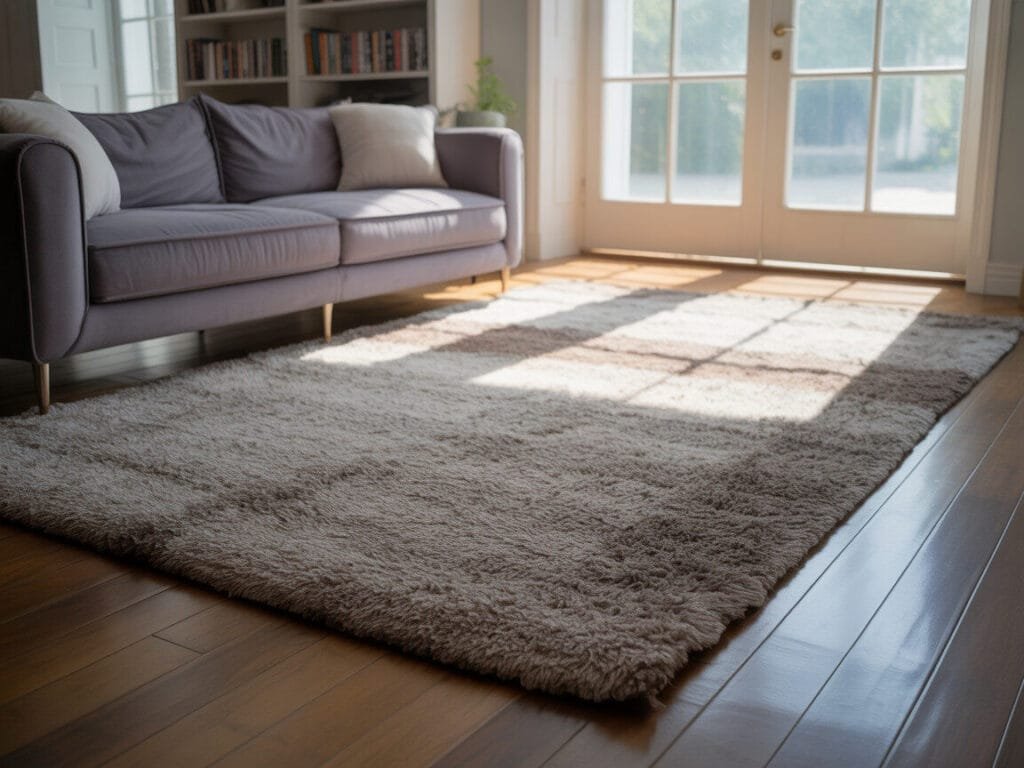
Oh boy, where do I even start with this one? The tiny postage-stamp rug sitting lonely in the middle of a living room is probably my biggest decorating pet peeve. It’s like wearing a crop top that’s three sizes too small – technically it covers something, but it’s not doing anyone any favors.
I once visited a friend who had this gorgeous sectional sofa and a beautiful Persian rug that was about the size of a bath mat underneath it. The whole room looked like it was trying too hard to be fancy but missing the mark entirely.
The Fix:
- Go bigger than you think you need – seriously, size up
- In living rooms, all front furniture legs should sit on the rug (or at least the front legs of major pieces)
- For dining rooms, the rug should extend at least 24 inches beyond the table on all sides
- When in doubt, measure twice and buy once
A properly sized rug anchors your space and makes everything look intentional instead of like you just randomly scattered furniture around.
Mistake #3: Hanging Artwork Too High
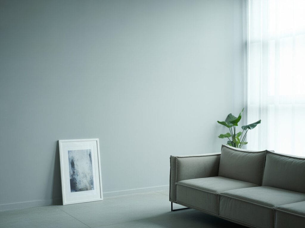
Picture this: you walk into someone’s home, and all the artwork is hanging so high you need a stepladder just to appreciate it. What is this, a museum for giants?
I used to make this mistake constantly because I’m tall, and what looked right to me was actually way too high for normal humans. My poor shorter friends would get neck cramps just trying to look at my wall art.
The Fix:
- Hang artwork at eye level – typically 57-60 inches from the floor to the center of the piece
- For gallery walls, treat the entire grouping as one large piece and center that at eye level
- Above furniture, leave 6-8 inches between the furniture top and the bottom of the artwork
- In dining rooms, you can go slightly lower since people are usually seated
Pro tip: Use painter’s tape to map out your arrangement before you start putting holes in the wall. Your walls (and your sanity) will thank you.
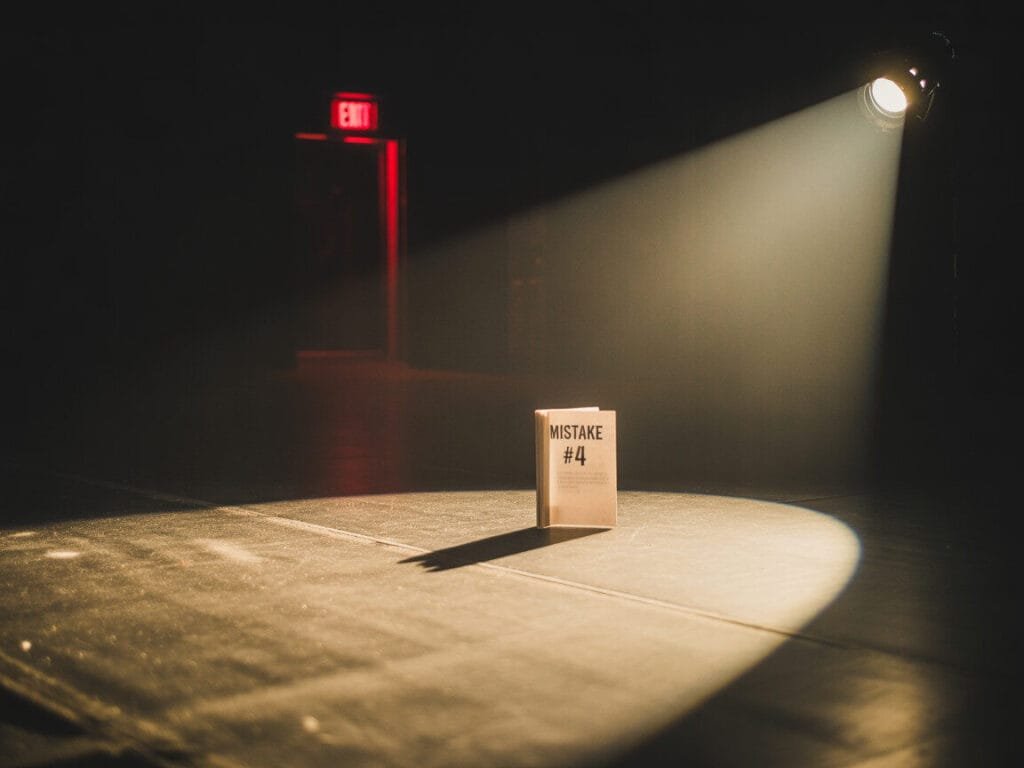
Mistake #4: Poor Lighting Choices
Let’s talk about the elephant in the room – or should I say, the single overhead light fixture trying to illuminate an entire space. Relying solely on that one harsh ceiling light is like trying to create ambiance with a spotlight. Spoiler alert: it doesn’t work.
I lived with terrible lighting for years because I thought “functional” was enough. Then I discovered the magic of layered lighting, and suddenly my home went from feeling like a fluorescent-lit office to actually cozy.
The Fix:
- Layer your lighting with three types: ambient (general), task (focused), and accent (decorative)
- Add table lamps, floor lamps, and wall sconces to create pools of light
- Use dimmer switches wherever possible – they’re your best friend for mood lighting
- Don’t forget about natural light – keep window treatments that can be opened during the day
Good lighting can literally transform a space from blah to beautiful. It’s probably the most impactful change you can make, IMO.
Mistake #5: Ignoring Scale and Proportion
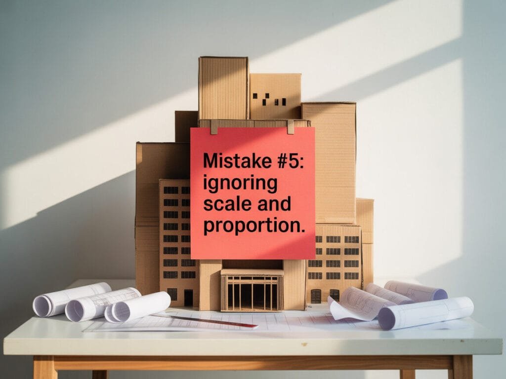
Ever seen a tiny coffee table drowning next to a massive sectional sofa? Or a huge painting overwhelming a small wall? That’s what happens when we ignore scale and proportion – and trust me, it’s more common than you’d think.
I once bought this adorable little side table that looked perfect in the store. When I got it home next to my oversized armchair, it looked like dollhouse furniture. Not exactly the sophisticated look I was going for!
The Fix:
- Match furniture sizes to your room and other pieces – a good rule is that your coffee table should be about 2/3 the length of your sofa
- Vary heights throughout the room to create visual interest
- Use the “rule of thirds” for wall art – it should take up about 2/3 of the wall space above furniture
- When mixing different sized pieces, make sure there’s intention behind it
Getting scale right makes everything look like it belongs together, rather than like you randomly collected furniture from different dollhouses.
Mistake #6: Neglecting Window Treatments
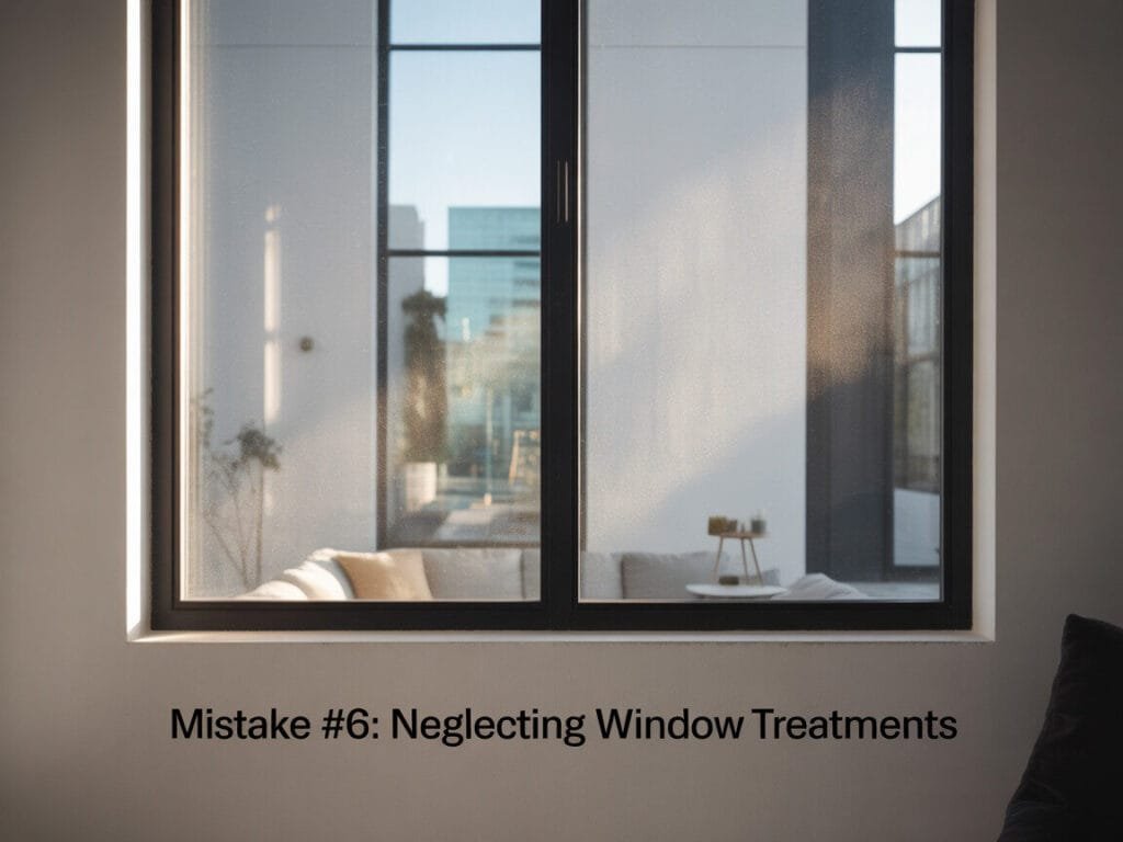
Bare windows are like wearing a beautiful outfit with no shoes – technically you’re dressed, but something’s definitely missing. I see so many gorgeous rooms that fall flat because the windows look unfinished and cold.
For the longest time, I thought curtains were just for privacy. Then I realized they’re actually one of the easiest ways to add softness, color, and sophistication to any room.
The Fix:
- Hang curtains high and wide – mount them close to the ceiling and extend the rod beyond the window frame
- Choose curtains that just touch the floor or puddle slightly for a luxurious look
- Layer treatments when possible – sheers for privacy and heavier panels for style
- Don’t forget about hardware – it’s like jewelry for your windows
Even inexpensive curtains can look expensive when hung properly. It’s all about the installation, people!
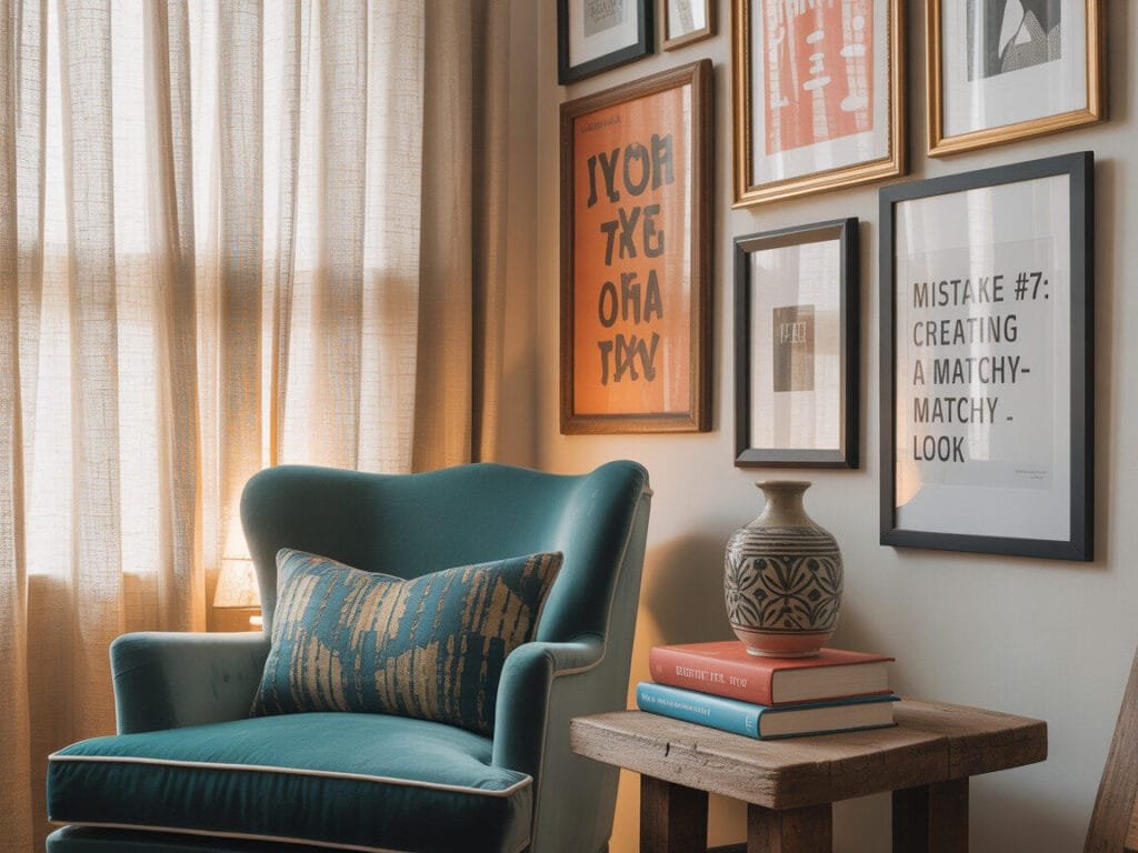
Mistake #7: Creating a Matchy-Matchy Look

You know those furniture showrooms where everything perfectly matches? Yeah, don’t recreate that in your home unless you want it to feel like a hotel lobby. I learned this lesson when I bought a complete bedroom set that matched so perfectly it looked like it came with a complimentary mint on the pillow.
The matchy-matchy look lacks personality and makes spaces feel generic and cold. Real homes should feel collected over time, not purchased in one shopping trip.
The Fix:
- Mix different wood tones, metals, and textures throughout your space
- Follow the 80/20 rule – 80% coordinated, 20% contrast
- Vary your furniture styles while keeping a cohesive color palette
- Add personal touches that reflect your personality and interests
FYI, the goal is to look like you’ve thoughtfully curated your space over time, not like you ordered everything from the same catalog page.
Mistake #8: Overcrowding Spaces
More isn’t always better, despite what some people seem to think. I’ve been in homes where you need a map just to navigate from the couch to the coffee table. When every surface is covered and every corner is filled, your eye doesn’t know where to rest.
I used to be guilty of this too – I thought filling every inch of space made it look “decorated.” Really, it just made it look cluttered and overwhelming.
The Fix:
- Embrace negative space – your room needs room to breathe
- Follow the “less is more” principle when arranging accessories
- Create clear pathways for easy movement through the space
- Group similar items together rather than scattering them throughout the room
Remember, your home should feel peaceful and welcoming, not like a furniture store explosion.
Mistake #9: Choosing Paint Colors in Isolation
Picking paint colors without considering your lighting, furniture, and existing elements is like choosing an outfit in the dark. I once painted my dining room a gorgeous sage green that looked amazing on the sample card but turned into something resembling baby food once it was on the walls with my warm-toned lighting.
The Fix:
- Test paint colors in your actual space with your actual lighting at different times of day
- Consider your room’s orientation – north-facing rooms need warmer colors, south-facing can handle cooler tones
- Look at how colors interact with your existing furniture and decor
- Don’t be afraid of color, but do be strategic about it
Paint is one of the most affordable ways to transform a space, but only if you choose the right color for your specific room.
Mistake #10: Forgetting About Functionality

Last but definitely not least – creating spaces that look pretty but don’t actually work for real life. I once arranged my living room so beautifully that nobody could actually watch TV comfortably. Form over function might work in magazines, but it doesn’t work in real homes where people actually live.
The Fix:
- Design for how you actually live, not how you think you should live
- Ensure adequate storage for your real-life clutter
- Make sure seating arrangements facilitate conversation and activities
- Consider traffic flow and daily routines when arranging furniture
The most beautiful room in the world is useless if it doesn’t work for your lifestyle.
Wrapping It All Up
Here’s the truth: decorating your home should be fun, not stressful. These mistakes happen to everyone – I’ve made most of them myself! The key is recognizing them and knowing how to fix them without starting from scratch.
Remember, great home decor is about creating a space that feels authentically you while following some basic design principles. You don’t need to be a professional designer or have an unlimited budget. You just need to avoid these common pitfalls and trust your instincts.
Your home should tell your story, reflect your personality, and most importantly, make you happy every time you walk through the door. So take these tips, apply what works for your space, and don’t be afraid to break a few rules along the way. After all, the best homes are the ones that feel lived-in and loved – mistakes and all.

- Safety and Environmental Friendliness: Our electric Candl Warmer Lamp gently melting the candle from the top down. With …
- Fully Dimmable and 12-Hour Timing Function: Enjoy complete control over the ambiance with our dimmable knob, offering un…
- Sleek Design, Versatile Usage: Combining classical elegance with modern aesthetics, our lamp features a metal base and g…


- Soft and Plush Chenille – Wrap your feet in the softest, coziest chenille, creating a warm haven for you, your family, a…
- Ultra Absorbent – Meet OLANLY’s absorbent bath rug with dense chenille, keeping floors clean when you step out of the ba…
- Fade-resistant and Quick-Drying – The premium microfiber fabric in our rugs isn’t just ultra-absorbent—it also dries qui…
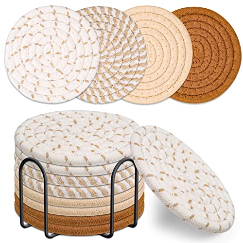
- What You Get: You will get more quantity and more multiple styles coasters from us than any others . You’ll get 8pcs rou…
- Why Choose Us?: Mckanti is committed to making better products intelligently. We abandon the complex and dazzling appear…
- No More Fear of Spills: Mckanti drink coasters are handcrafted from 100% cotton and linen. They are more absorbent than …
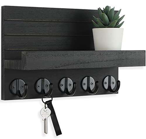
- KEEP TRACK OF KEYS and other items attractively with the Lwenki Key Holder for wall with shelf. This entryway shelf with…
- STRONG, LIGHTWEIGHT paulownia wood makes the Lwenki Mail and Key Holder for wall a warm and inviting focal point of your…
- UPGRADED HOOKS give our wall mount key holder more versatility of use. Use the key hooks to reduce clutter in your home’…

- Mirror Full Length: The size of the full length mirror is 64″x21″. The large size of the mirror allows you to display yo…
- High-tech Materials: Full body mirror is made of superior nano tempered glass and one piece aluminum alloy frame that ca…
- Wall & Stand: Full body mirror can be used in a variety of ways, it can be stand on the floor, leaned against the wall, …
Author
Disclosure: This post contains affiliate links. If you make a purchase through these links, I may earn a small commission at no extra cost to you.